Alan

How do we help therapy users build confidence in choosing the right therapist when selecting on a digital platform for the first time?

Discovery to delivery
(©2026)
thumbnail alan project
Role
Product Designer
Timeline
1 week
Scope
Discover to Deliver
Tools
Figma

Context

(01)

What is Alan ?

Alan is a European health insurance company that combines coverage with a digital health platform, so members can book care, talk to doctors and get reimbursed from one app.

Why this project ?

Alan wants to design a user experience that optimises the matching process between members and therapists, that answers member's specific needs and facilitates video consultation.

What was the problem ?

The “Select a therapist” screen had the biggest drop-off in the booking flow. With digital therapy still new in France, the challenge was to design a matching experience that helps people confidently choose the right therapist and book a video consultation.
(02)

KPIs

Our success
metrics

↳ Drop-off rate at “Select a therapist” : The share of members who reach the screen but don’t choose a therapist. A lower rate shows the matching gives people what they need to decide.

↳ Booking rate for first video consultations : The share of members who select a therapist and go on to book a video consultation. It shows the matching leads to real use.

↳ Confidence in the choice : After three appointments, members rate from 1 to 5 how sure they are their therapist is right for them. It checks that people choose well, not just faster.

(03)

Design process

(04)

About my work

I led this project end to end as the sole designer, from user interviews and problem definition to ideation, user flows, high-fidelity UI design and prototyping. I then ran usability tests and used the feedback to refine the design.

(05)

User
Research

Objectives

↳ Understand the decision : How people choose a therapist, what worries or reassures them along the way.

↳ Identify barriers to digital therapy : What holds people back from online therapy in France, from stigma to discomfort with video.

↳ Uncover what builds confidence : Which information and signals help members feel sure they’ve picked the right therapist.

Interview
Parameters

#5 participants
↳ Young adults (25-30 years old)
↳ Professionals
↳ Have experience with therapy or are interested in it
↳ 30-minute interview

What we learnt ?

5/5

users prefer in-person to online therapy

"

I think it’s less effective than real life. Because there are some markers that your therapist wouldn’t be able to pick up on such as your movements, your ticks.

— Zacharie, 29 years old

5/5

users want detailed, comparable profiles before choosing

"

I’d like to see their CV put into different metrics that are easy to compare between different doctors.

— Duy Anh, 28 years old

3/5

users need price and location upfront

"

I would look at the pricing that suits my price range. And the therapists are nearby where I live.

— Thu Phuong, 29 years old

5/5

users think they need time before deciding if it is a fit

"

I'd need 3 or 4 sessions to see if they're genuinely trying to help me.

— Hélen, 31 years old

(07)

Ideation

CRAZY 8

I sketched eight ideas to explore ways of helping users feel more confident in their choice of therapist, then chose the best ones from there.

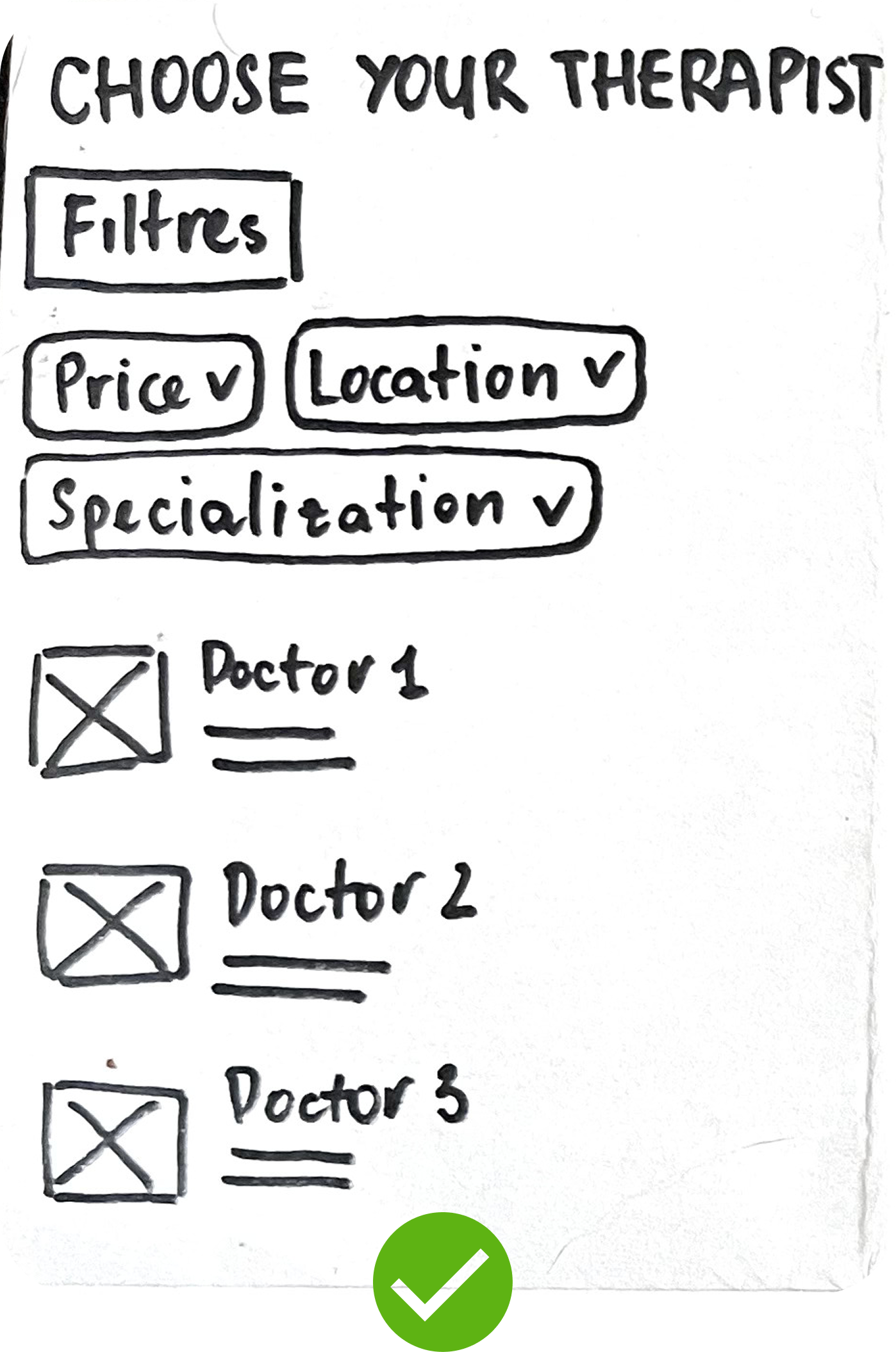
sketch 1 alan case study
Advanced filter system
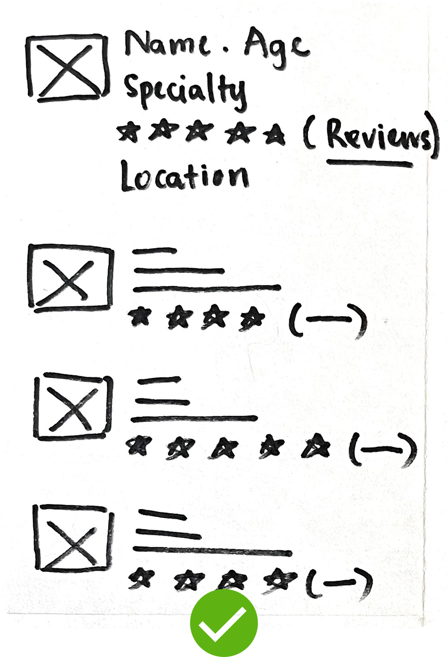
sketch 2 alan case study
Rating and reviews
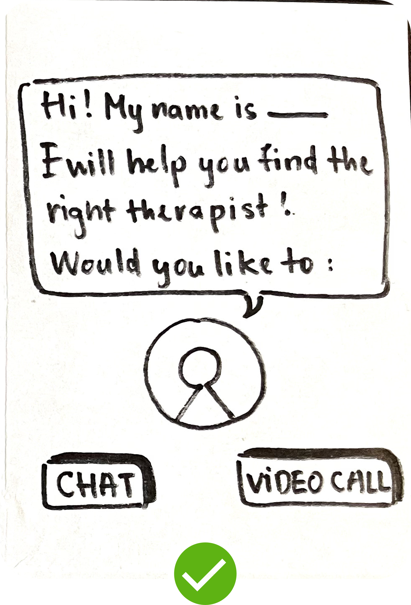
sketch 3 alan case study
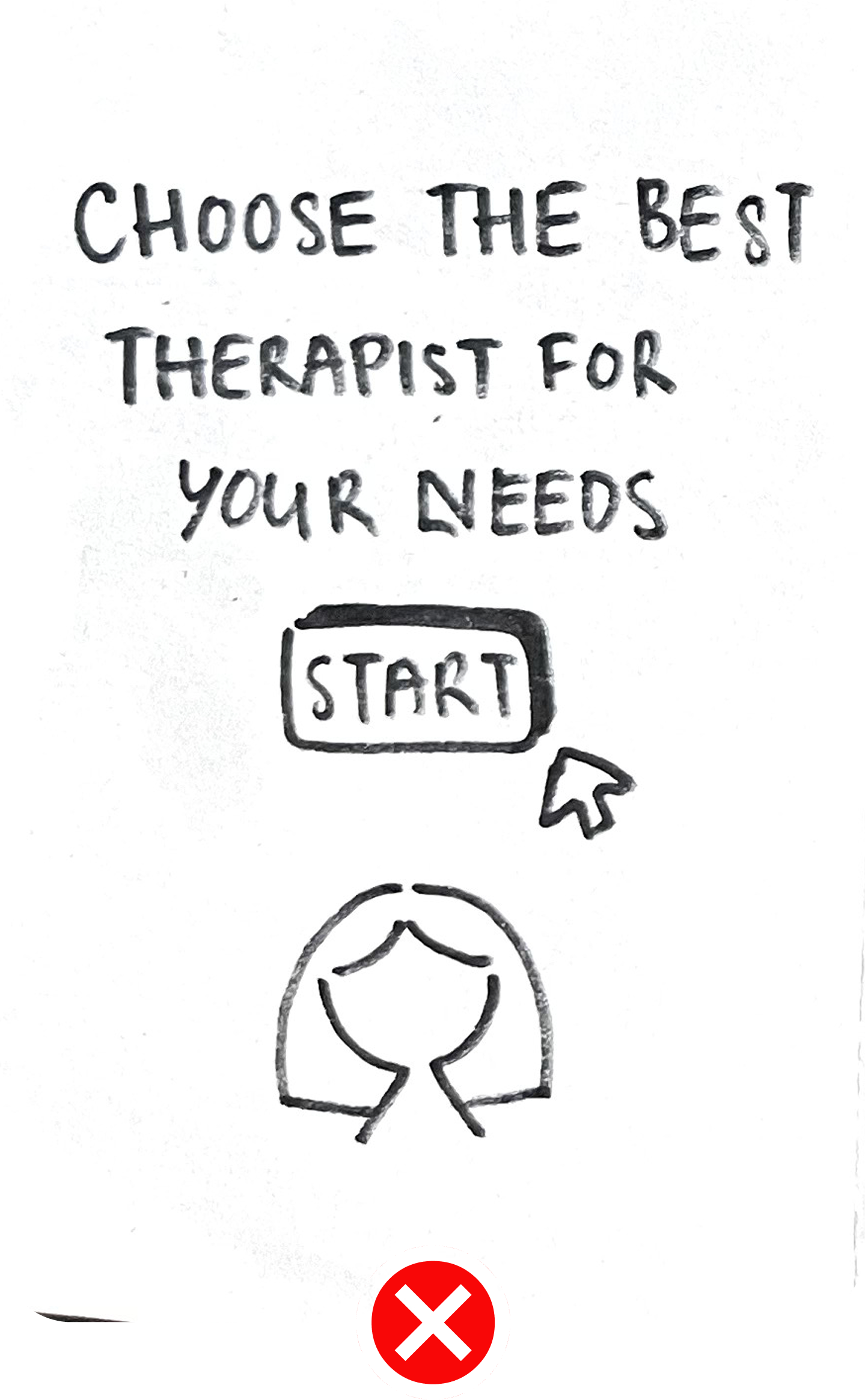
Live assistance
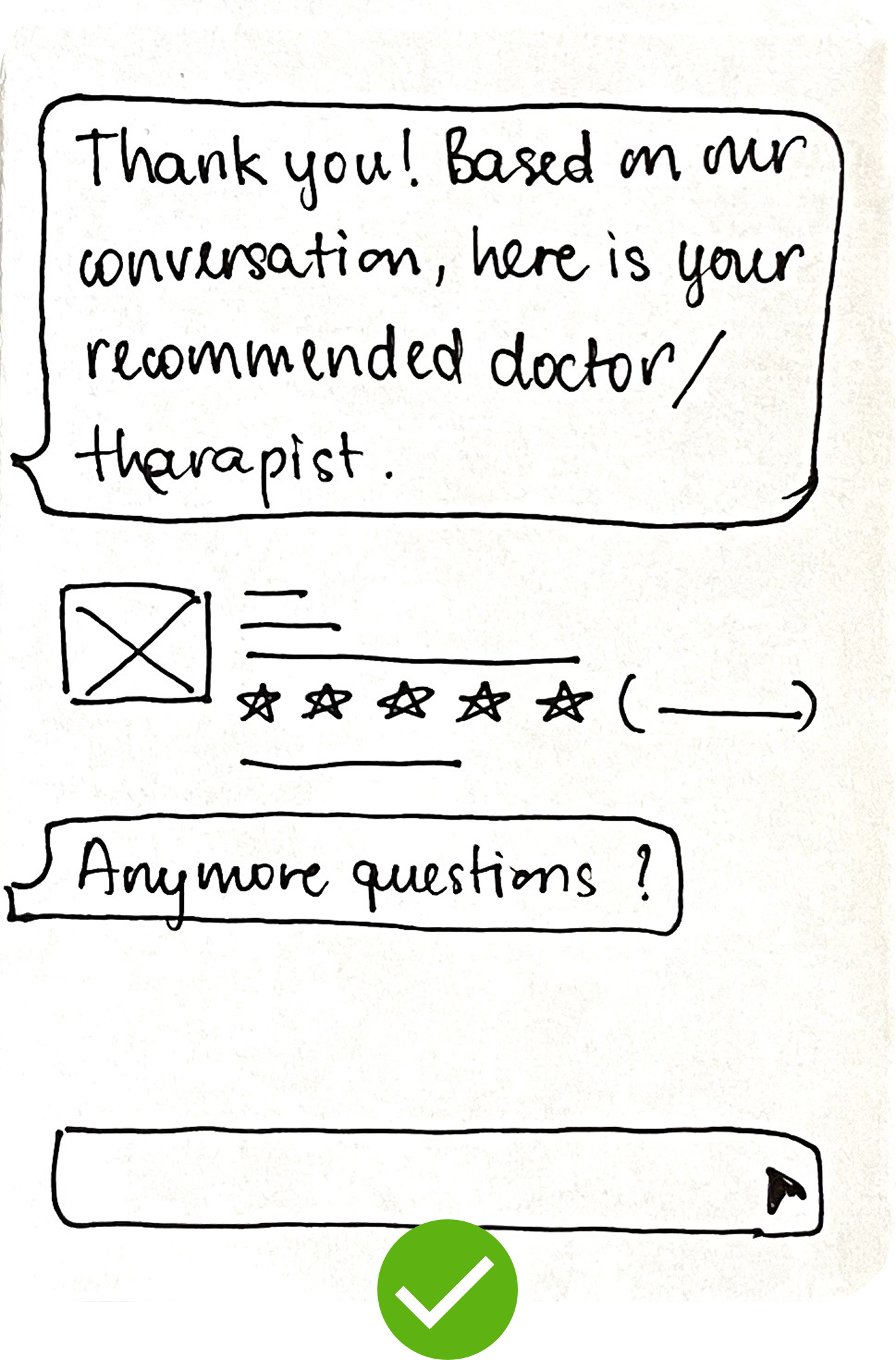
sketch 4 alan case study
Guided conversation-based journey
sketch 5 alan case study
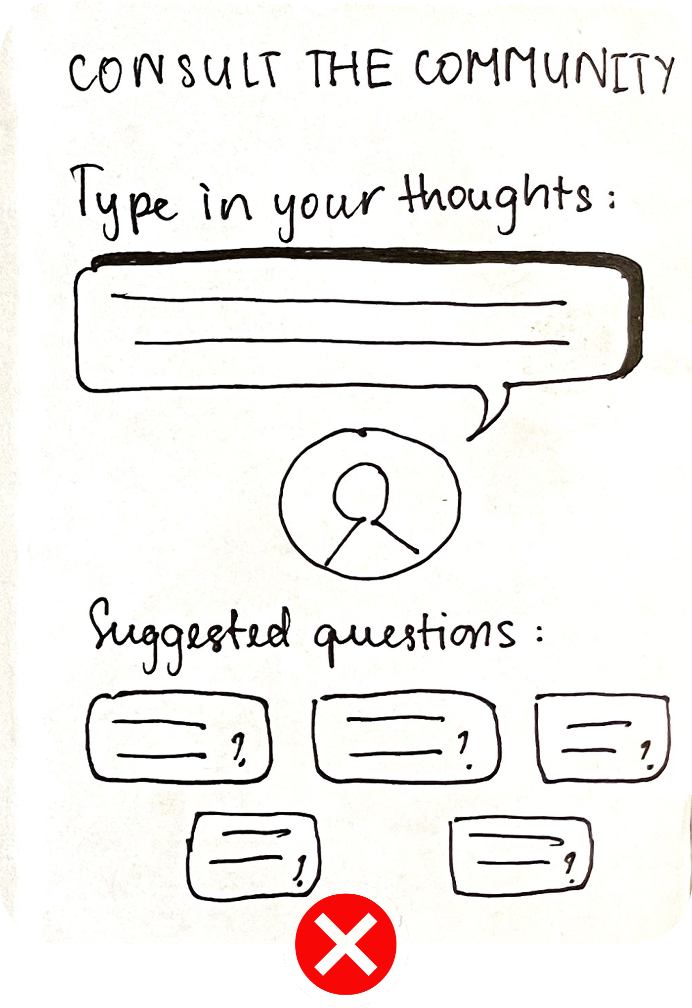
Community-based guidance
sketch 6 alan case study
AI-personalised recommendation

USER JOURNEY

I sketched a user journey that gives members a support option: if they can’t decide, they can chat or video call a live assistant who recommends a therapist that matches their needs.

User journey alan case study
(07)

Prototype

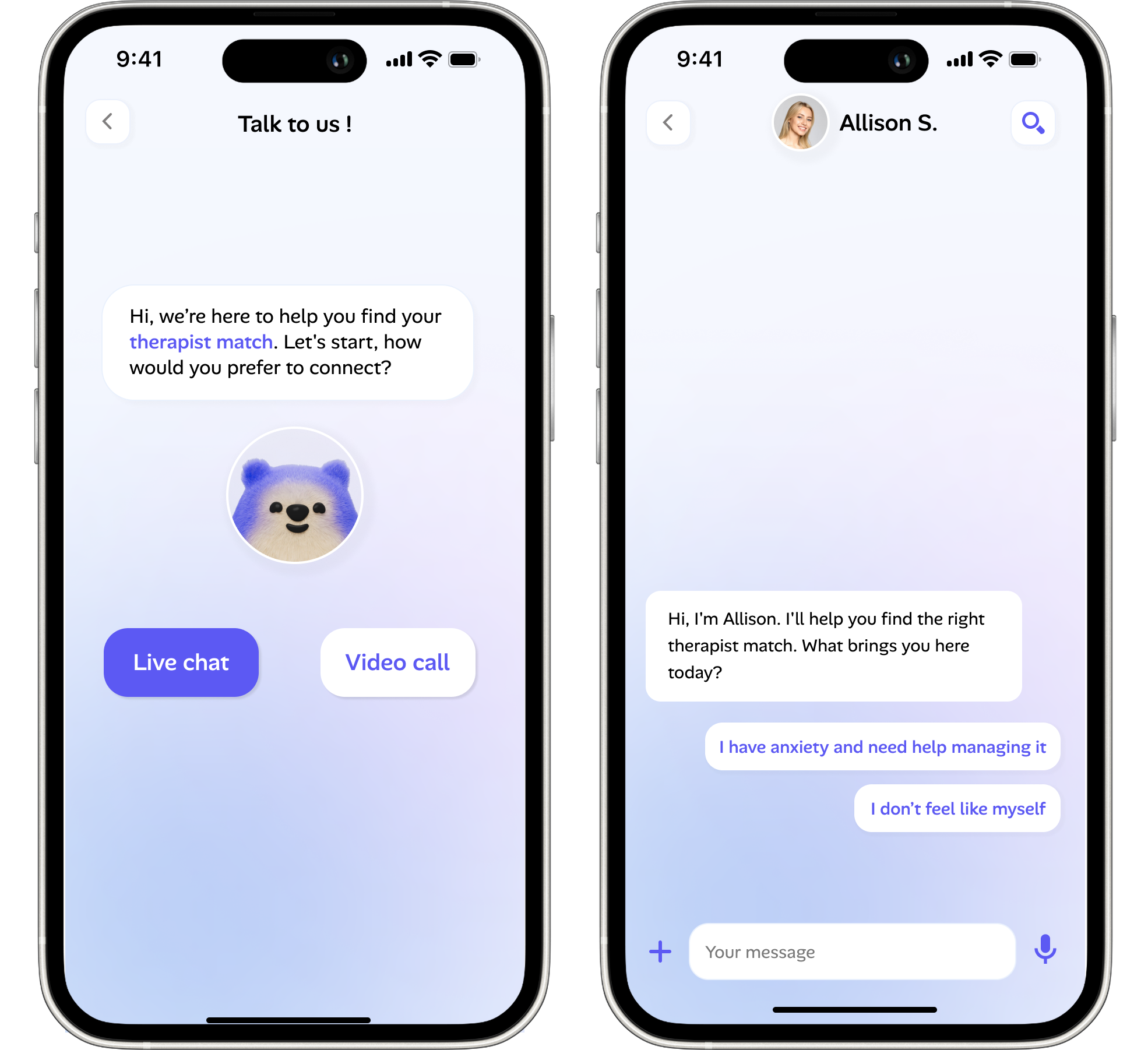
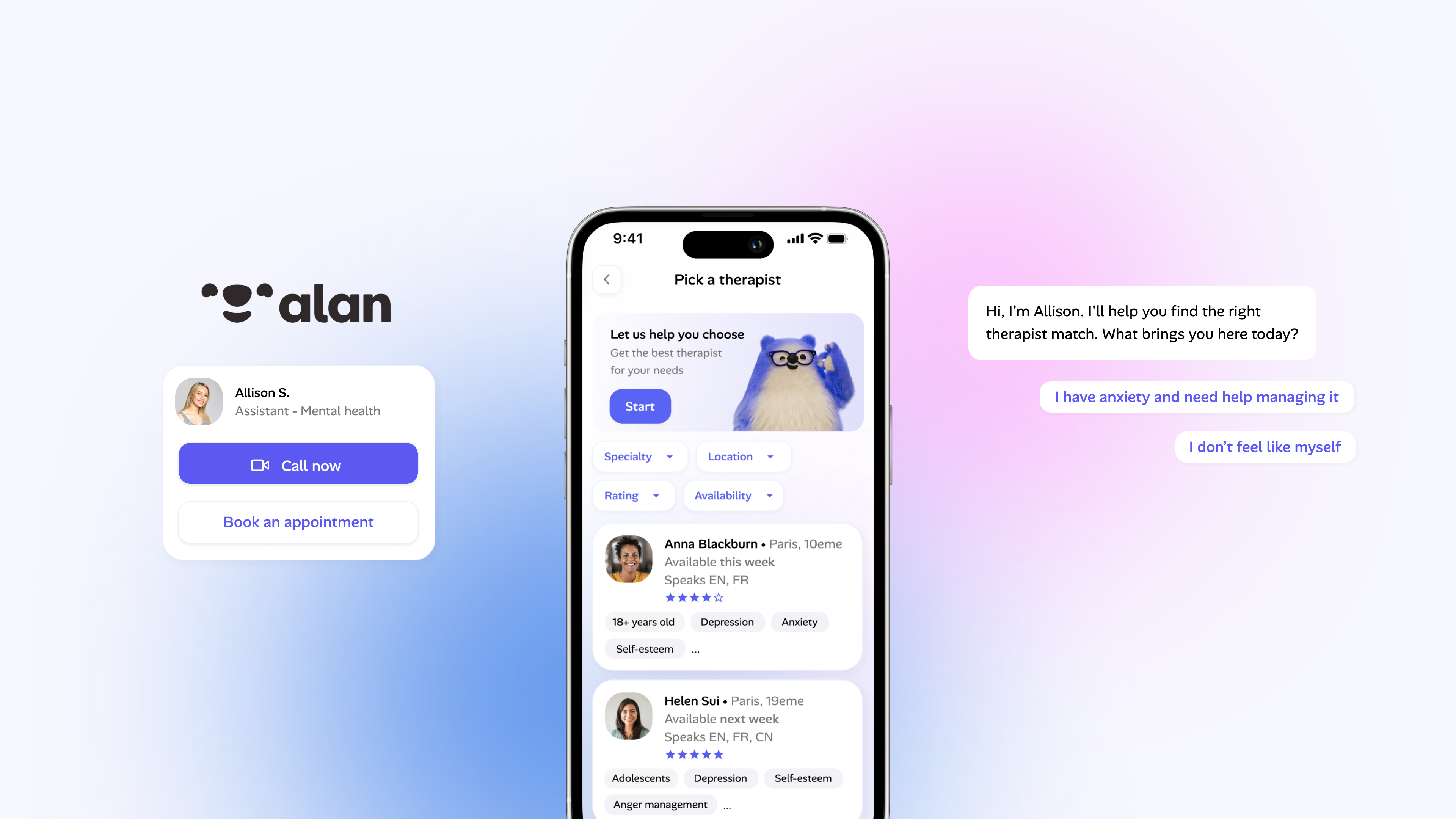
I built an interactive prototype to test live assistance, where users can chat or call a real person to help them choose a therapist that fits their needs.

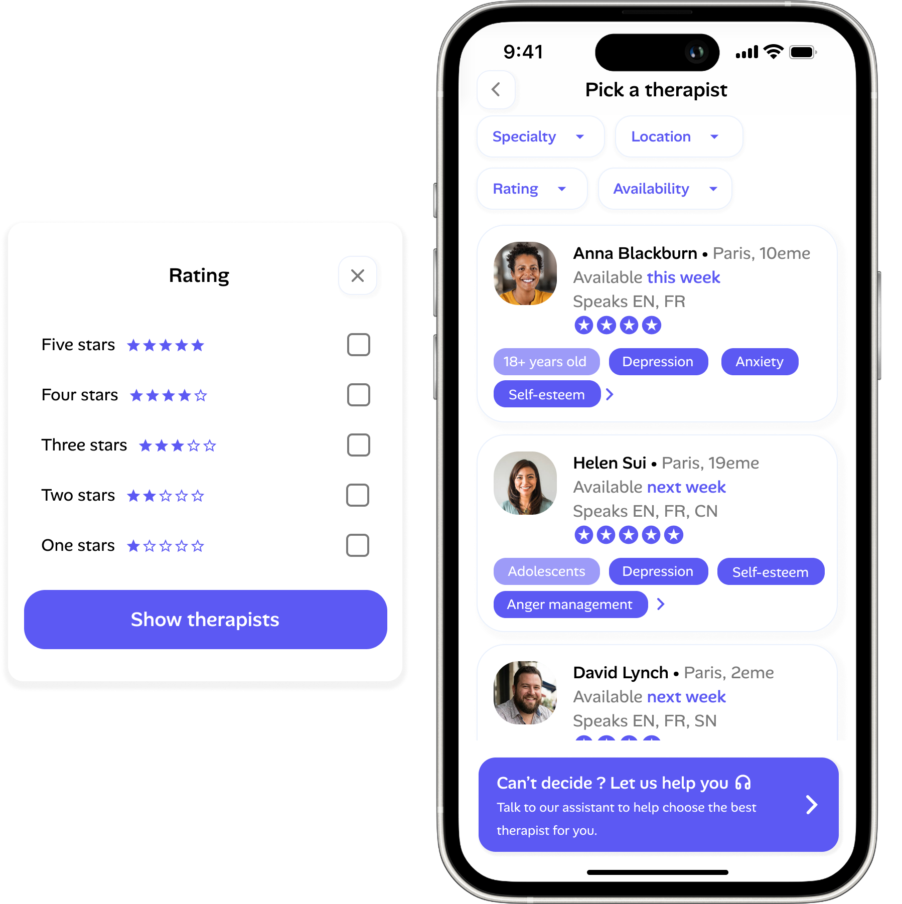
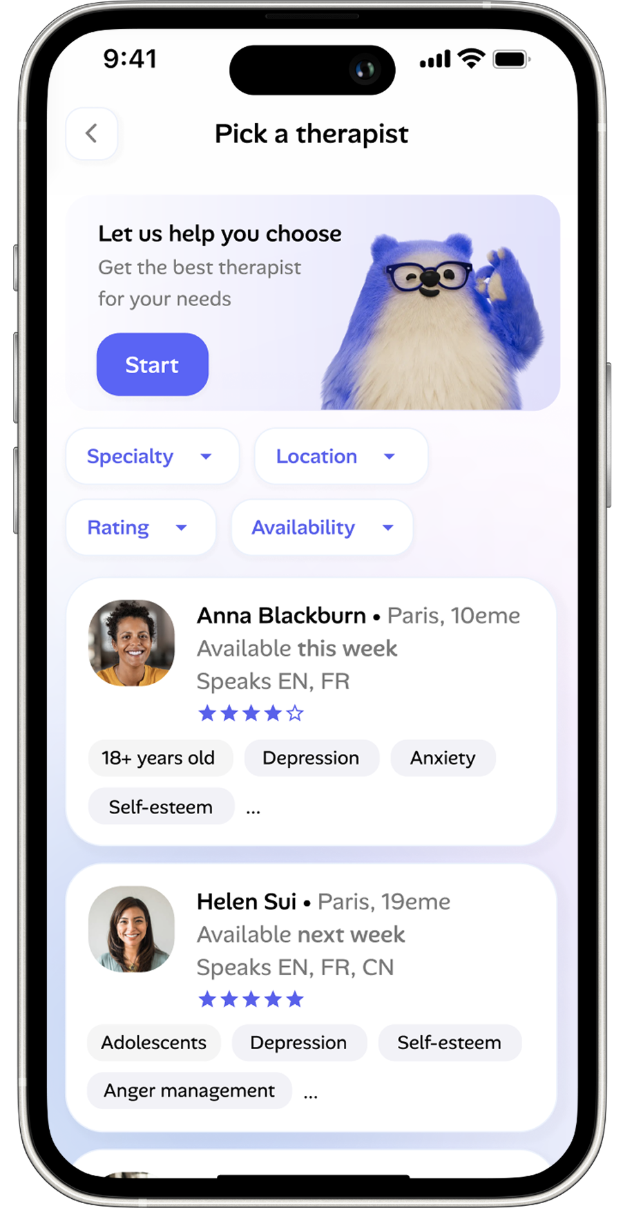
Advanced filters

↳ Find the right fit faster. Narrow down therapists by rating, location and availability, on top of speciality and language.
feature 1 alan case study

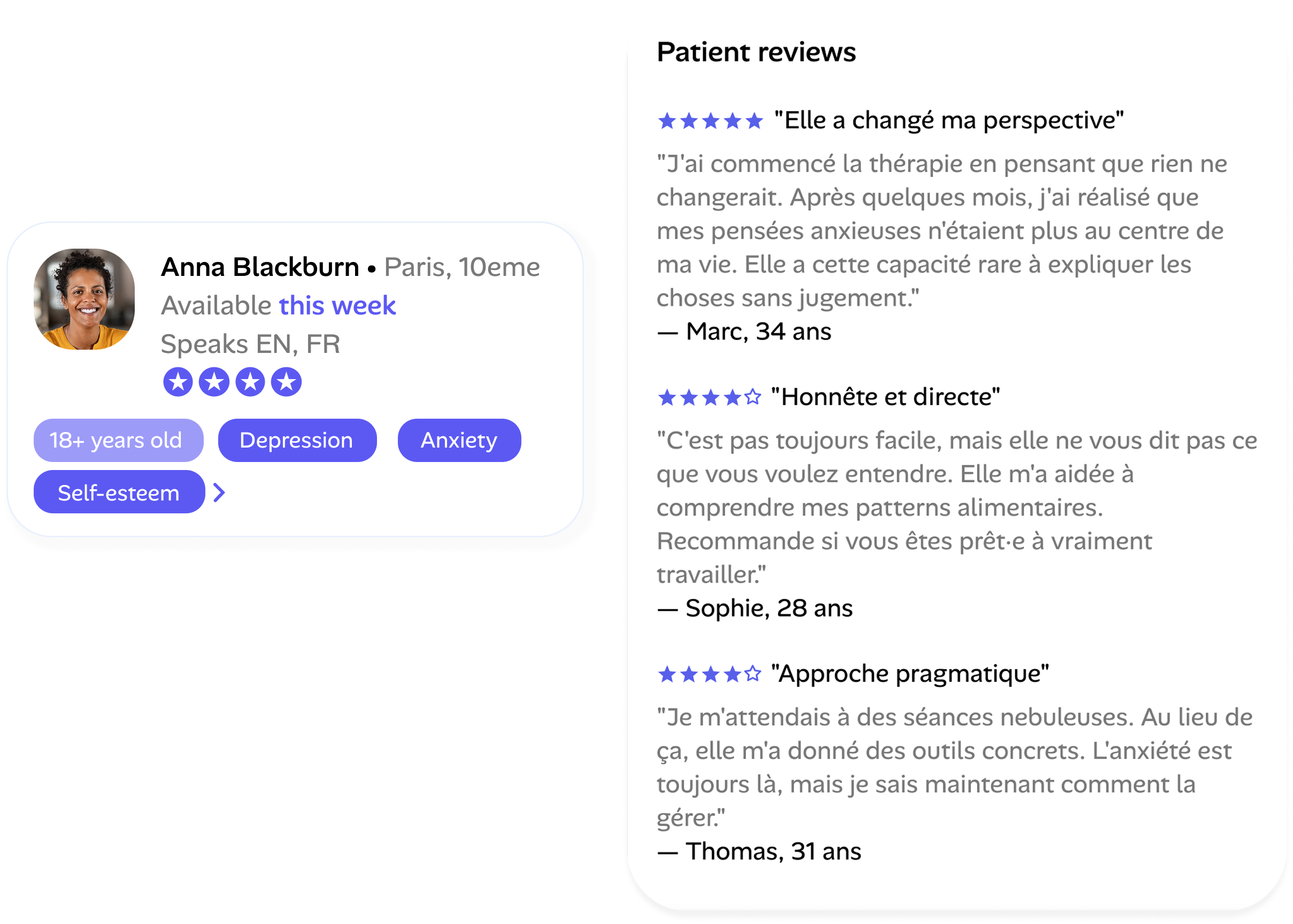
Ratings and reviews

↳ Real feedback from past patients adds a layer of trust to each profile, helping members compare therapists and feel sure about their decision.
feature 2 alan case study

Live assistance

↳ Members can chat or call a real assistant who helps them find a therapist that matches their specific needs, so a hesitant first step becomes a guided one.
feature 3 alan case study
(08)

User
Test

Objectives

↳ Validate the therapist selection flow
↳ Uncover critical information gaps
↳ Test the support pathway as a fallback

Interview
Parameters

#3 participants
↳ Young adults (25-30 years old)
↳ Professionals
↳ 45-minute interview

What we learnt ?

2/3
Users prefered to see an onboarding section before the therapist list
3/3
users engaged with filters or considered them as part of browsing strategy
Ease of use

"

I'd prefer a section in the beginning as an introduction. It's confusing to me to see directly a list of people.

— Thu Phuong, 28 years old

2/3
Users would like to see pricing and specific locations in the profiles
2/3
users prefered to see review section positioned higher-up in the profiles
Information gap

"

I'd put the reviews higher up, that's the most important criteria to me, the education isn't relevant to me.

— Zacharie, 29 years old

3/3
struggled to find the therapist section from home
2/3
Users struggled to find or navigate to Support when needed
Navigation

"

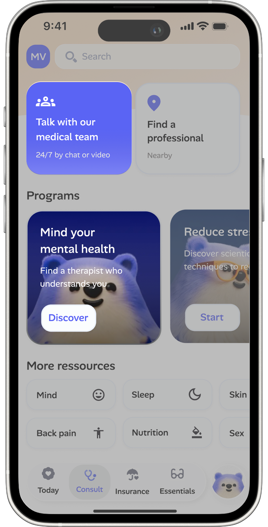
The mental health section isn't clear to me. I clicked on the 'Talk to our medical team' again by accident.

— Duy Anh, 28 years old

3/3
Users reported the support flow was clear once accessed
1/3
Users found the layout of the profile cards confusing
Information gap

"

The screen looks a bit too busy to me. The design of the cards isn't clear to the background. The information bubbles look like buttons to me.

— Duy Anh, 28 years old

(09)

Adjustments following the test

iteration 1 alan case study
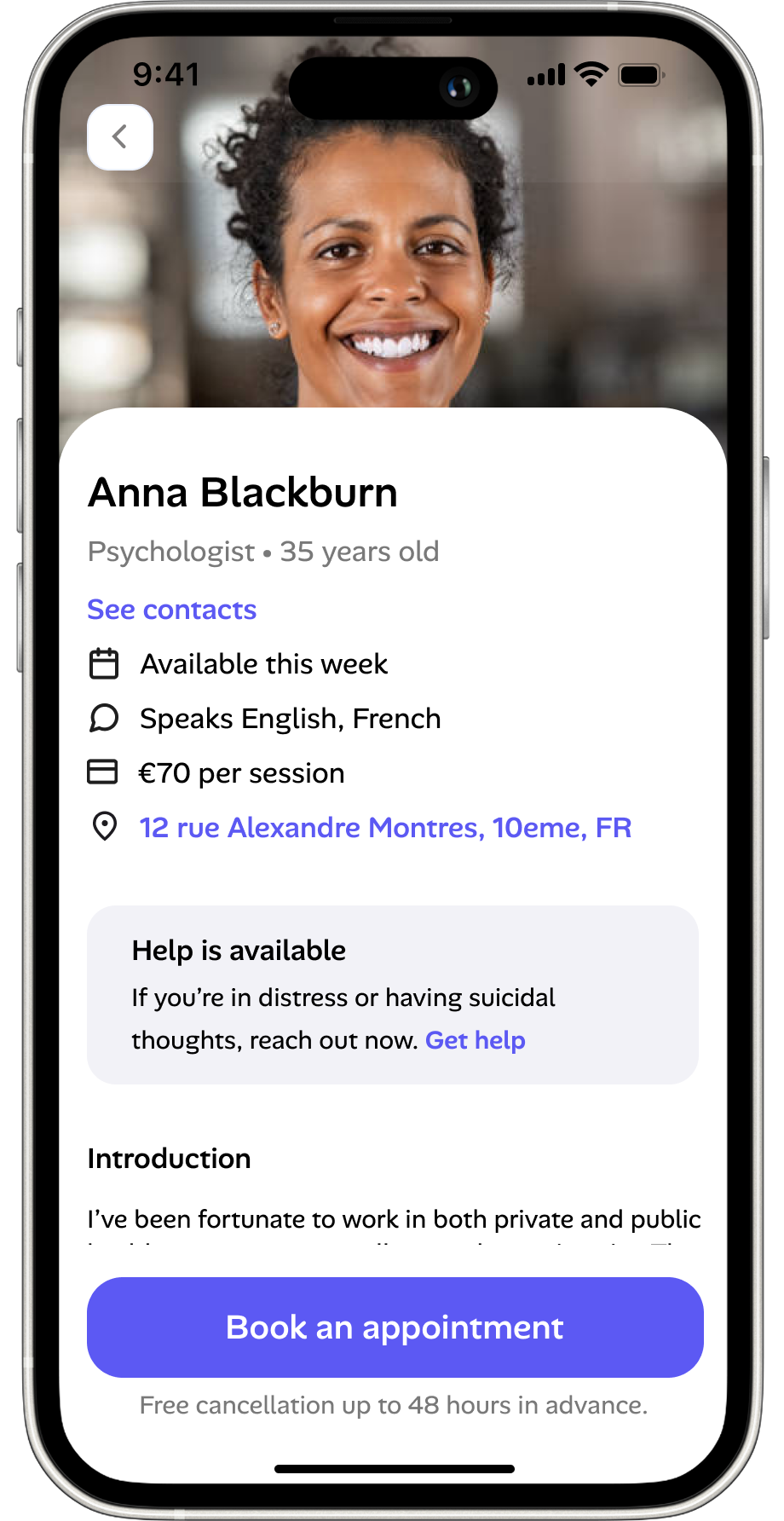
Richer profiles
Added key details to each profile and moved reviews higher, where users look first
iteration 2 alan case study
Clearer path
Added a second way to reach “Choose your therapist” straight from the first screen
iteration 3 alan case study
Easier to scan
Moved Support to the top of the screen to be stickier, it also served as an intro before the therapist list
iteration 4 alan case study
Clearer layout
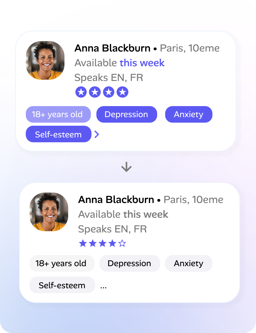
Redesigned the profile cards so key information is easier to scan and compare
(10)

Final
Prototype

After several improvements, here's the final solution !

(11)

Conclusion

This project showed me that choosing a therapist is as much an emotional decision as a practical one. By giving members richer profiles, reviews, better filters and a live assistant when they feel unsure, the design turns a hesitant choice into a guided one. Usability testing helped me refine the flow, and the next step would be to measure its impact on drop-off, booking rate and confidence in the choice.